
Bootstrap, which was initially developed by Twitter, is an open-source CSS framework that is designed to help developers create responsive and mobile-first websites quickly and easily. Offering a wide range of reusable components and pre-designed templates, Bootstrap significantly reduces the time spent on design and development, while still allowing for extensive customization.
Bootstrap consists of CSS, JavaScript, and HTML components that can be pieced together to build user-friendly interfaces that are aesthetically appealing. The framework takes advantage of the latest web technologies and standards, ensuring that websites built with Bootstrap are modern, accessible, and responsive.
Bootstrap employs a mobile-first design strategy, which means it’s optimized for mobile interfaces from the ground up. This approach is beneficial considering the prevalent use of smartphones for web access. Bootstrap sites can smoothly scale from small to large screens, ensuring an excellent user experience on a wide variety of devices.
Bootstrap is known for its powerful 12-column grid system. It uses flexbox, a CSS layout module, to design complex and dynamic web layouts. The grid system makes it easy to align elements horizontally and vertically, and to adapt the layout to different screen sizes.
The 12-column grid can be divided into various configurations based on the requirements of your web page. For example, if you want three equal-width columns, you would assign each column four grid spaces (since 12 divided by 3 equals 4). The Bootstrap grid system is responsive, so developers can specify different layouts for different screen sizes.
Bootstrap offers a large collection of reusable components, including navigation bars, dropdowns, progress bars, modals, alerts, and much more. These components are styled with CSS and enhanced with JavaScript, providing functionality right out of the box.
One significant advantage of Bootstrap’s component system is that developers can focus on the unique parts of their application, rather than re-inventing the wheel each time they need a common web element. All components follow the same design language, ensuring a consistent look and feel across your application.
While Bootstrap provides a solid and cohesive set of styles out of the box, it’s also highly customizable. Developers can override the default styles and adjust the look and feel to meet their project requirements. Bootstrap uses Sass, a powerful CSS preprocessor, which makes it easier to customize the design.
Bootstrap offers numerous utility classes that help with everything from margins and padding to text alignment and display properties. These classes are incredibly efficient for developers who wish to make quick adjustments without having to write additional CSS.
Besides CSS, Bootstrap also comes with a number of jQuery plugins that provide additional functionality. These plugins add interactive elements such as tooltips, carousels, modals, and collapsible elements. Moreover, with the introduction of Bootstrap 5, developers can now choose to use these plugins with either jQuery or JavaScript, offering more flexibility.
Getting started with Bootstrap is straightforward and can be achieved in a few steps. Here’s a simple guide on how to start using Bootstrap in your project:
<head> section of your HTML file:<!-- CSS only -->
<link href="https://stackpath.bootstrapcdn.com/bootstrap/5.0.0-beta1/css/bootstrap.min.css" rel="stylesheet">
<!-- JS, Popper.js, and jQuery -->
<script src="https://code.jquery.com/jquery-3.5.1.slim.min.js"></script>
<script src="https://cdn.jsdelivr.net/npm/@popperjs/core@2.6.0/dist/umd/popper.min.js"></script>
<script src="https://stackpath.bootstrapcdn.com/bootstrap/5.0.0-beta1/js/bootstrap.min.js"></script>Remember to replace the version number with the most recent one.
<!doctype html> at the top of your HTML files.<head> of your HTML file, which looks like this: <meta name="viewport" content="width=device-width, initial-scale=1">..row and .col classes, or use Bootstrap’s custom .btn classes to style buttons.As you become more comfortable with Bootstrap, you can start to explore more advanced features, like its JavaScript plugins or its Sass variables for custom theming. Remember, the key to mastering Bootstrap, like any other tool, is practice and exploration.
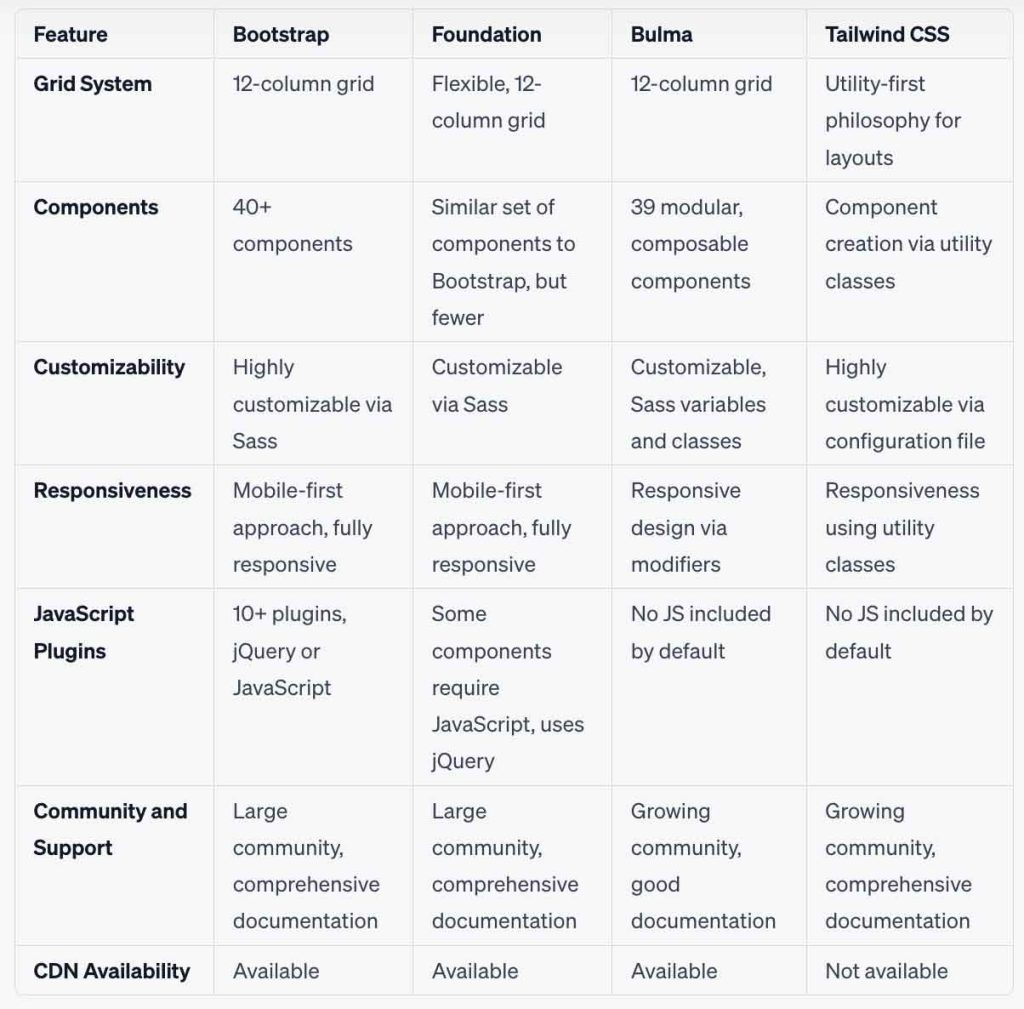
Bootstrap is one of the most popular frameworks for front-end development with CSS. However, there are other frameworks that have similar strengths and features that compare to Bootstrap.
Below is a side by side comparison of Bootstrap to Foundation, Bulma, and Tailwind CSS with regard to key components of each of the frameworks, including:
Bootstrap is an excellent tool for both novice and experienced web developers. Its combination of a flexible grid system, pre-designed components, and extensive customizability can save significant development time. Plus, its mobile-first design philosophy ensures that the websites you build are optimized for the current age of mobile web browsing.
Learning and using Bootstrap requires a basic understanding of HTML, CSS, and JavaScript. However, the efficiency and consistency that the framework brings make it a worthwhile addition to any web developer’s toolkit. And, thanks to the extensive documentation and supportive community, getting started with Bootstrap is easier than ever.