
Material-UI is a popular open-source framework that implements Google’s Material Design using React components. It’s a powerful and flexible tool that allows developers to create interactive and appealing web applications rapidly. Material-UI makes it easier to design consistent user interfaces while adhering to modern web design principles.
Material-UI is built on top of Facebook’s React library. This means that every component in Material-UI is a React component. It inherits React’s composability, unidirectional data flow, and a component-based architecture, which helps to maintain and manage complex UIs.
Material Design, developed by Google, is the design philosophy at the heart of Material-UI. It seeks to create a visual language that synthesizes classic principles of good design with the innovation of technology and science. It provides guidelines for visual, motion, and interaction design across platforms and devices.
Material-UI is great for accomplishing what it was designed for, namely implementing Google’s Material Design. When considering using Material-UI with your tech stack, it’s helpful to know how Material-UI’s strengths compare to its limitations with regard to the core purposes for which it was built.
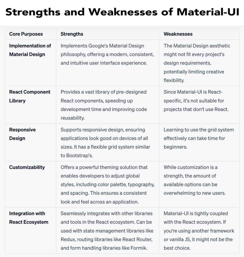
Material-UI comes with a broad range of pre-designed components such as buttons, cards, dialogs, sliders, tables, and many more. Each of these components can be customized to fit the specific needs of your application.
Using these pre-made components can significantly speed up the development process. Instead of writing each component from scratch, developers can use Material-UI’s components as building blocks to create complex UIs.
Material-UI offers excellent customization options. The theme capability in Material-UI is powerful. It allows developers to define a custom theme, including color palette, typography, and spacing, which can be applied across the entire application, providing a consistent look and feel.
It uses CSS-in-JS for styling, which allows you to use JavaScript to describe styles in a declarative, conflict-free, and component-friendly way. Furthermore, Material-UI supports server-side rendering, making it a great choice for building SEO-friendly websites.
Like Bootstrap, Material-UI also provides a robust grid system. It uses a 12-column grid, which is a flexible and efficient way to lay out content. This grid system makes it easier to design responsive layouts, ensuring your website looks great on devices of all sizes.
Material-UI can be seamlessly integrated with other libraries in the React ecosystem. For instance, you can use Material-UI components with state management libraries like Redux, or form libraries like Formik or react-hook-form.
Starting with Material-UI is simple. All you need to do is install the @material-ui/core package using either npm or Yarn. Once installed, you can import and use Material-UI components in your React components.
bashCopy code# with npm
npm install @material-ui/core

# with Yarn
yarn add @material-ui/core
To use a Material-UI component, simply import it and use it in your JSX code:
jsxCopy codeimport Button from '@material-ui/core/Button';

function App() {
  return (
    <Button color="primary">
      Hello, Material-UI
    </Button>
  );
}

export default App;
Material-UI is a modern and robust framework that brings Google’s Material Design to React applications. Its vast and customizable component library and robust grid system can help speed up the development process and create beautiful, responsive, and consistent user interfaces.
While Material-UI does require knowledge of React, its comprehensive documentation, community support, and integration with the broader React ecosystem make it a valuable tool for developers at all levels.